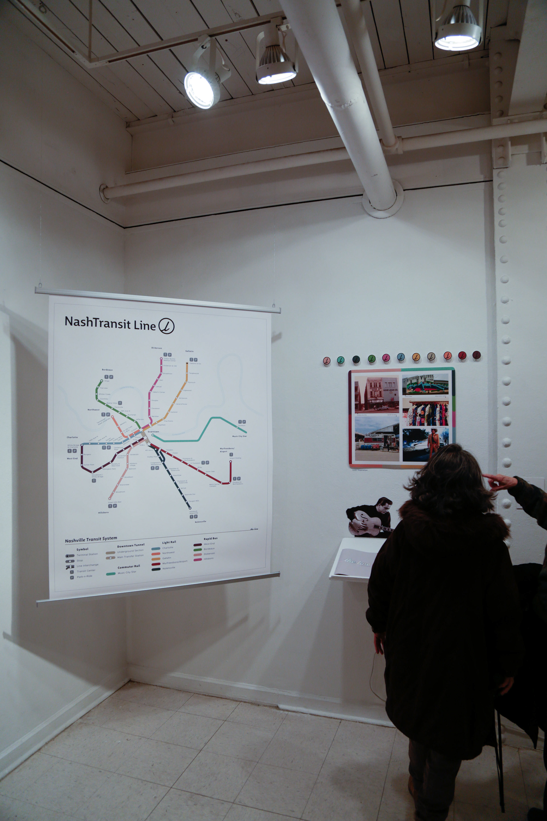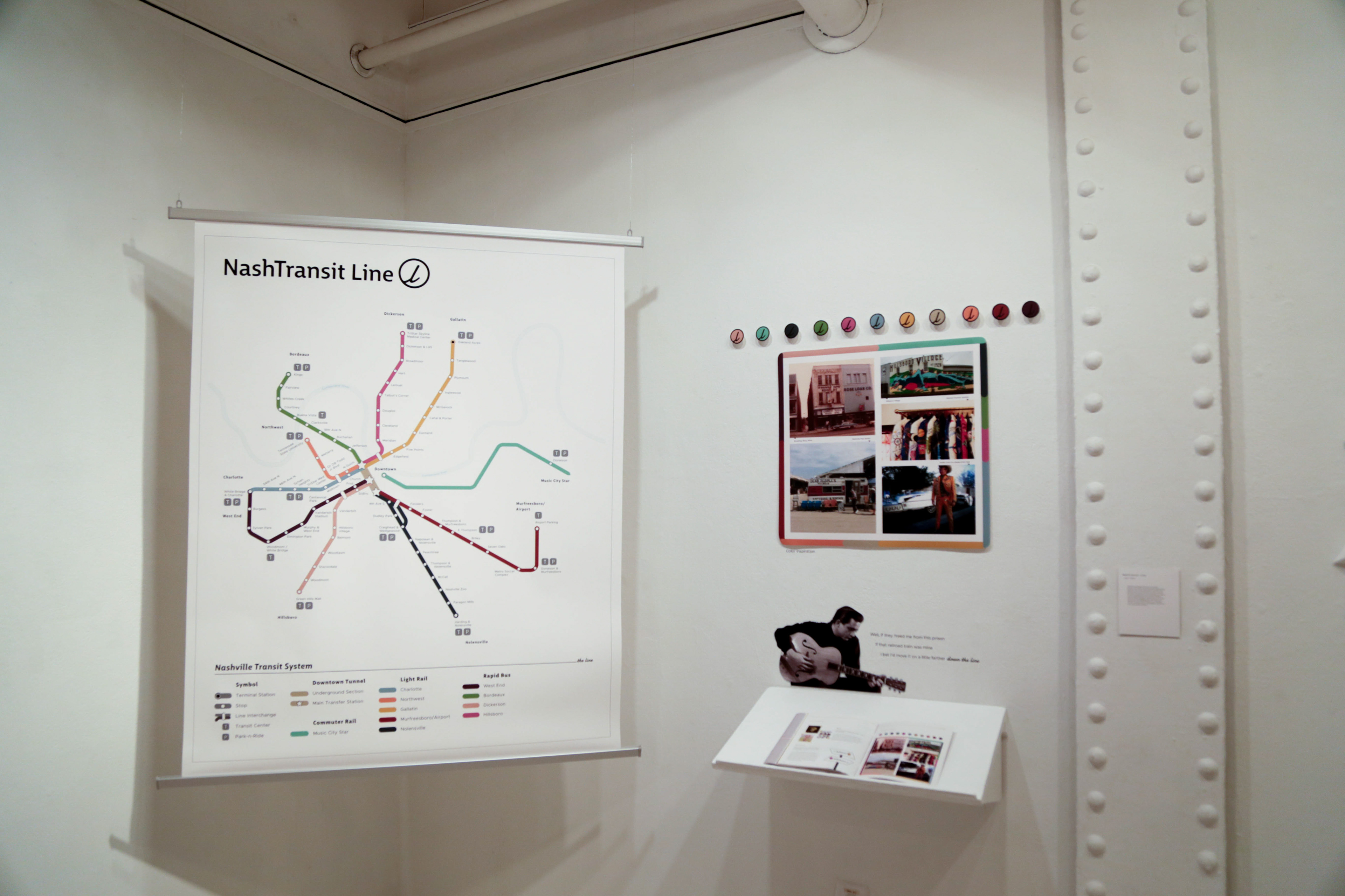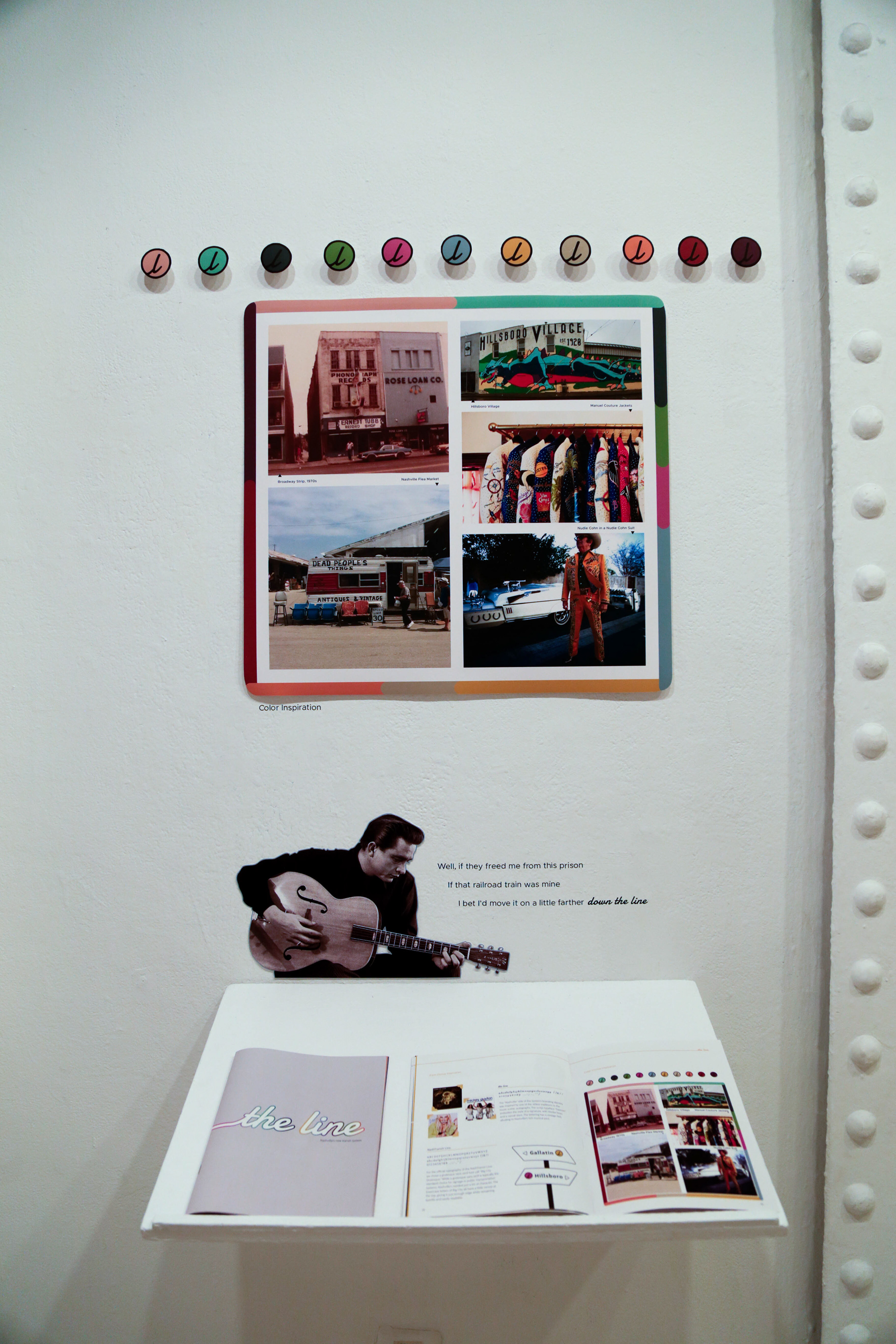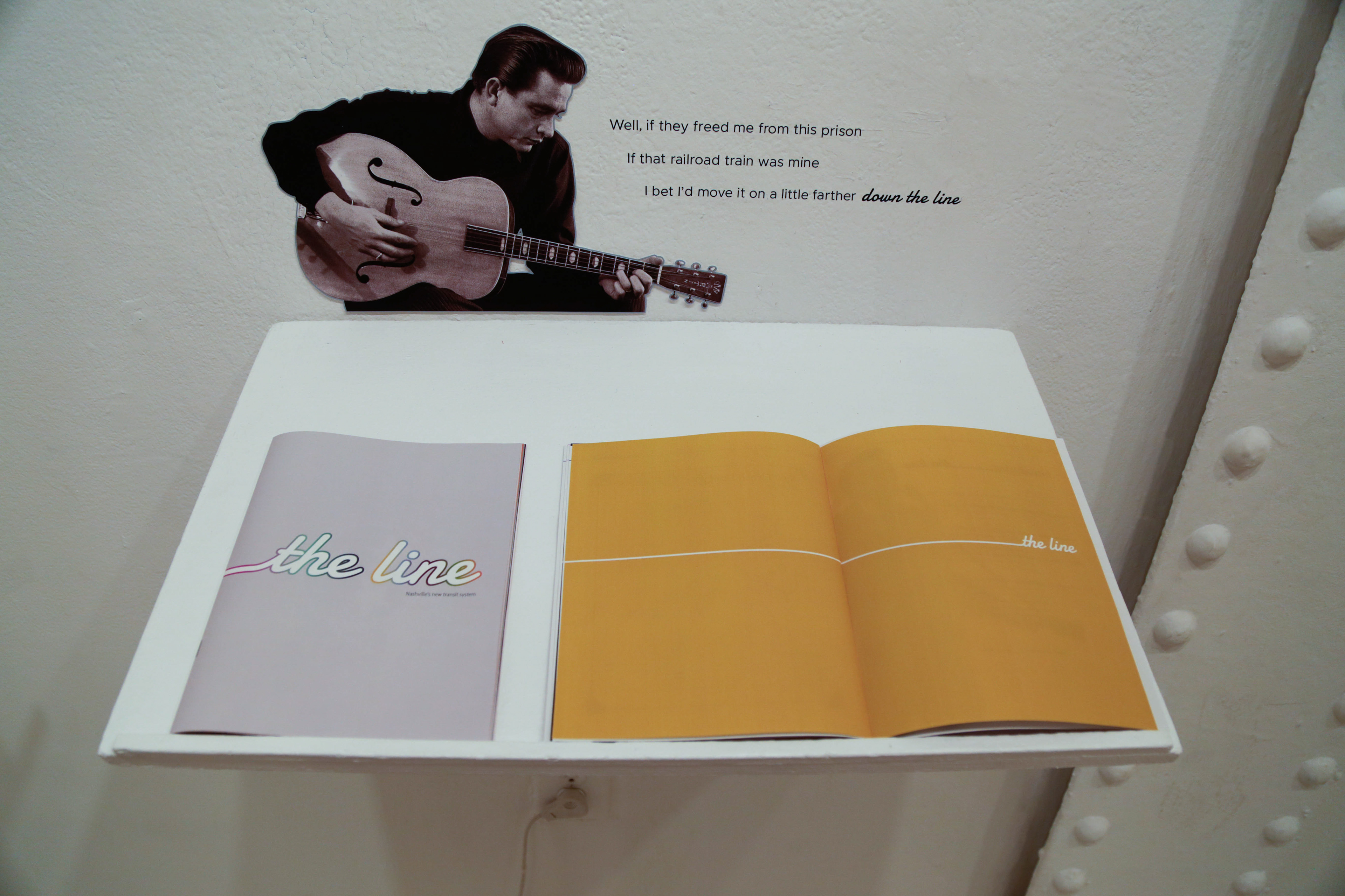


I was born in Nashville, and for my master's thesis I wanted to craft a branding identity system worthy of Nashville's unique, magnetic atmosphere—paying tribute to its country music scene, while highlighting other aspects that locals love about the city. The cornerstone of this project is the transit map itself, which I created after extensive research into precedents, accessibility, eye tracking software, and existing proposals from the Nashville government to chart potential routes. The brand identity is friendly, approachable, and unique, mirroring the energy of city. The NashTransit Line, or colloquially "the line," references country music lyrics like "down the line," and "walk the line." The main typeface is Big City Grotesque, which is highly readable while maintaining a friendly character with subtle swoops. The typeface for the logomark and "the line" is Damion, alluding to autographs signed in Sharpie, a thread that runs throughout music history.
